~~~~~~~~ MAIN TASK- FINAL MOVIE TRAILER ~~~~~~~
Saturday, 2 May 2015
QUESTION 4
How did you use media technologies in the construction and research, planning and evaluation stages?
During the construction of my media products, I used various media technologies in order to achieve the main goal for my products- being able to tell of its genre and seem realistic.
For my main task, I had decided to use iMovie when constructing my piece as it offers a wide range of editing tools and sound effects that I could use for a movie trailer. i researched into different areas of which the genre might have been before deciding the the dystopian genre would be best to present my film. I used YouTube.com to find other trailer within the same genre and use them as style models. I had also taken a look at other media students work from previous years that where also posted on YouTube. When it had same to planning, I had hand drawn sketches of what I would like it to look like whilst leaving myself reminders of how to shoot the scene as well as transitions and music. Once planning was done, I then had the time to film it using a Cannon Coolpix camera and then to the editing. Once I had started editing it on iMovie, I had decided to add more effects to it to show off some action scenes.
For these scenes I had included a filter that was available on iMovie. This made a scene filmed in the day look like it had been filmed in the dark. Additionally, I had used a filter near the end to make the electric on the wall look more blue and brighter than it originally was. For evaluation, I had taken into account my style models once again and compared both along side each other in order to get a full understanding of what my trailer connotes and how it is presented by its genre.
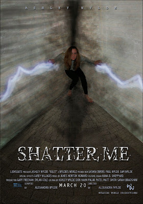 I had constructed my movie poster in Adobe Photoshop in order to have more features and tools to work with. With working with graphic design in my art classes, i had wanted to create the background to my liking instead of using a still image taken from the camera. To do this I had used paint, smudge, occupancy and vibrant tools to create the background. For research, I had looked at two genres of posters at first. Action and Dystopian. I had found that action posters had a close up shot of the main character and is rather simple. However, the dystopian genre had the main character in an action shot and having a relatable image to the movie. I had decided to focus on the dystopian posters as I wanted to give a clear understanding to my audience of the genre and movie itself. To evaluate my poster I had posted it on Facebook for audience feedback. From looking over the poster, I had been given an understanding that some people may not know of the dystopian genre or my poster is more futuristic looking.

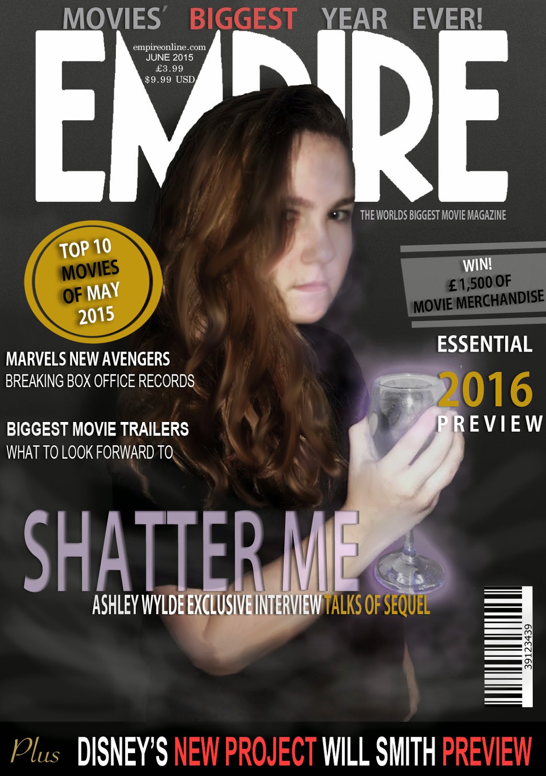
For my movie magazine front cover, I had also created it in Adobe Photoshop in order to use different tools. In the construction I had used a similar process to my movie poster. With the background and the main image itself I had used the smudge and paint tool as well as different occupancies to make the whole image look darker. Whilst relating back to my style models (all 'EMPIRE' magazine) I had used the main title and sub headings that have been used previously but still changed to relate to the current magazine. This is also for my research as my style models had helped me relate to an actual magazine and keep in mind all of the conventions of a movie magazine. For planning my cover, I once again took into account the style models and different conventions used for movie magazine. Trial and error was used in most of the process as I couldn't get colours right to suggest the genre to the audience. Similar to the movie poster I had posted it on Facebook to receive audience feedback. I received comments that my magazine cover would not look out of place on shelves and connotes the genre well. Because of this, I had made minimal changes to my media product. Using last years work, I had also taken into account what I had already created and how I had represented that genre whilst creating that one.
During the construction of my media products, I used various media technologies in order to achieve the main goal for my products- being able to tell of its genre and seem realistic.
For my main task, I had decided to use iMovie when constructing my piece as it offers a wide range of editing tools and sound effects that I could use for a movie trailer. i researched into different areas of which the genre might have been before deciding the the dystopian genre would be best to present my film. I used YouTube.com to find other trailer within the same genre and use them as style models. I had also taken a look at other media students work from previous years that where also posted on YouTube. When it had same to planning, I had hand drawn sketches of what I would like it to look like whilst leaving myself reminders of how to shoot the scene as well as transitions and music. Once planning was done, I then had the time to film it using a Cannon Coolpix camera and then to the editing. Once I had started editing it on iMovie, I had decided to add more effects to it to show off some action scenes.
For these scenes I had included a filter that was available on iMovie. This made a scene filmed in the day look like it had been filmed in the dark. Additionally, I had used a filter near the end to make the electric on the wall look more blue and brighter than it originally was. For evaluation, I had taken into account my style models once again and compared both along side each other in order to get a full understanding of what my trailer connotes and how it is presented by its genre.
 I had constructed my movie poster in Adobe Photoshop in order to have more features and tools to work with. With working with graphic design in my art classes, i had wanted to create the background to my liking instead of using a still image taken from the camera. To do this I had used paint, smudge, occupancy and vibrant tools to create the background. For research, I had looked at two genres of posters at first. Action and Dystopian. I had found that action posters had a close up shot of the main character and is rather simple. However, the dystopian genre had the main character in an action shot and having a relatable image to the movie. I had decided to focus on the dystopian posters as I wanted to give a clear understanding to my audience of the genre and movie itself. To evaluate my poster I had posted it on Facebook for audience feedback. From looking over the poster, I had been given an understanding that some people may not know of the dystopian genre or my poster is more futuristic looking.
For my movie magazine front cover, I had also created it in Adobe Photoshop in order to use different tools. In the construction I had used a similar process to my movie poster. With the background and the main image itself I had used the smudge and paint tool as well as different occupancies to make the whole image look darker. Whilst relating back to my style models (all 'EMPIRE' magazine) I had used the main title and sub headings that have been used previously but still changed to relate to the current magazine. This is also for my research as my style models had helped me relate to an actual magazine and keep in mind all of the conventions of a movie magazine. For planning my cover, I once again took into account the style models and different conventions used for movie magazine. Trial and error was used in most of the process as I couldn't get colours right to suggest the genre to the audience. Similar to the movie poster I had posted it on Facebook to receive audience feedback. I received comments that my magazine cover would not look out of place on shelves and connotes the genre well. Because of this, I had made minimal changes to my media product. Using last years work, I had also taken into account what I had already created and how I had represented that genre whilst creating that one.
QUESTION 2
How effective is the combination of your main product and ancillary texts?
My main product is the style model for all of my ancillary texts. Based on the decisions I have made with the genre of the movie trailer and how it is presented, I wanted to foreshadow this in my poster and magazine front cover. From the conventions of the poster, it is shown that it is of a dystopian genre. These conventions include the way it is presented with the Sci-fi look to the electricity show from the hands of the main character. This gives it the futuristic look that sets it apart from being a horror movie poster. The combination of both the poster and trailer both contribute to the genre and make it seem like an action packed film, this may bring in a male audience as most teen dystopians are more directed towards female young adults.
 As for my magazine front cover, I had researched into 'EMPIRE' magazine covers for style models. With taking into consideration all of the conventions I had seen from the style models, I had also compared it to how the cover themselves linked to their trailer of the movies. For example, this iron man 2 cover connotes to the genre of the movie being a futuristic action movie. I wanted to recreate this by looking back at my main task and using techniques for the main image that I had used whilst filming. In my opinion, a more effective scene in the trailer was where I had used UV paint and light to make a 'cracked electric' look on the wall. I wanted to recreate this in an image by taking this and adding it to the image, giving it the dystopian (futuristic) action genre to the cover. Whilst choosing the wine glass to glow, I took into account the story line of the trailer. This being that the main character is contained and then thrown into a more rich lifestyle as a bribe to become a weapon for the opposing team. With giving the wine glass, I wanted to create an effective distinction between the way she is presented and how she feels about it. I gave her the sophisticated look by giving her the wine glass, but with the electric going through it- connotes that she is against it.

With my movie poster, I had the similar idea to link to the main task, however taking the opposite side to the story and showing the confinement of the main character in the cell. I used different connotations to relate to the story line of the movie trailer. For example, I created the main characters shadow stretching out from the corner to show the other side to her and connote that it is 'reaching out'. This gives a darker meaning to the poster as their are darker sides to the story. To create the action/ dystopian aspect of the poster, I once again added the electric to the walls to suggest that she will fight to get released from the cell and fighting back suggesting the action genre to the movie.
Overall, all of my tasks have been planned out to link the the main task in order to give an effective advertising to people who may be interested and give the 'sneak peak' into what the movie is going to be about.

My main product is the style model for all of my ancillary texts. Based on the decisions I have made with the genre of the movie trailer and how it is presented, I wanted to foreshadow this in my poster and magazine front cover. From the conventions of the poster, it is shown that it is of a dystopian genre. These conventions include the way it is presented with the Sci-fi look to the electricity show from the hands of the main character. This gives it the futuristic look that sets it apart from being a horror movie poster. The combination of both the poster and trailer both contribute to the genre and make it seem like an action packed film, this may bring in a male audience as most teen dystopians are more directed towards female young adults.
 As for my magazine front cover, I had researched into 'EMPIRE' magazine covers for style models. With taking into consideration all of the conventions I had seen from the style models, I had also compared it to how the cover themselves linked to their trailer of the movies. For example, this iron man 2 cover connotes to the genre of the movie being a futuristic action movie. I wanted to recreate this by looking back at my main task and using techniques for the main image that I had used whilst filming. In my opinion, a more effective scene in the trailer was where I had used UV paint and light to make a 'cracked electric' look on the wall. I wanted to recreate this in an image by taking this and adding it to the image, giving it the dystopian (futuristic) action genre to the cover. Whilst choosing the wine glass to glow, I took into account the story line of the trailer. This being that the main character is contained and then thrown into a more rich lifestyle as a bribe to become a weapon for the opposing team. With giving the wine glass, I wanted to create an effective distinction between the way she is presented and how she feels about it. I gave her the sophisticated look by giving her the wine glass, but with the electric going through it- connotes that she is against it.
With my movie poster, I had the similar idea to link to the main task, however taking the opposite side to the story and showing the confinement of the main character in the cell. I used different connotations to relate to the story line of the movie trailer. For example, I created the main characters shadow stretching out from the corner to show the other side to her and connote that it is 'reaching out'. This gives a darker meaning to the poster as their are darker sides to the story. To create the action/ dystopian aspect of the poster, I once again added the electric to the walls to suggest that she will fight to get released from the cell and fighting back suggesting the action genre to the movie.
Overall, all of my tasks have been planned out to link the the main task in order to give an effective advertising to people who may be interested and give the 'sneak peak' into what the movie is going to be about.
Friday, 1 May 2015
Thursday, 30 April 2015
Voice Over Update
Half of the voice over for my movie trailer has been completed. However, the voice actor for the main male lead was not available and I was unable to contact anyone else. I will be able to contact them Thursday this week for the voice over and plan to add it to the movie trailer on this friday.
Additional Update
I have recently trimmed the audio file down in order to be in time with my movie trailer. I had created this by watching the movie trailer along side the recording process. I had used Apple's GarageBand whilst recording the voice over.
Additional Update
I have recently trimmed the audio file down in order to be in time with my movie trailer. I had created this by watching the movie trailer along side the recording process. I had used Apple's GarageBand whilst recording the voice over.
Update
With both tasks finished, I can now move onto answering the questions. Next week I plan to add the voice over to my movie trailer as a new layer of sound on Imovie. After this is done, I will use different software to present my answers to the questions on. These will further be displayed on my blog.
Wednesday, 29 April 2015
Final magazine cover
This is the final draft of the magazine cover. The only changes I had made where to add another sub heading. I had originally intended to create a new 'plus!' banner found at the bottom of the page. However, as I had started to do it, I didn't like the idea as it was in contrast with the 'EMPIRE' title too much with being in white. I decided not to make the change.
Magazine Cover update
Here is the transitioning of the main image and the editing gone into creating the movie poster. I started off by painting the background and using a gradient, whilst having the main image cut out on top. I added shadow to the main image and different editing features such as contrast and gamma to bring down the vibrancy. I used the paint tool to colour the purple shadows of the cup and reflection on to the face- as well as defining the eyes by making them darker. I also used the smudge tool to make the image look crisper.
I then proceeded to add the headings and barcode by using the text tool and adding drop shadows in order to read them. I did this all by looking at my style models and making creative decisions in order for it to be effective in its genre and as a movie magazine regarding the conventions.
Magazine Cover update
Over the Easter holiday term I had taken the pictures needed for magazine front cover. I chose the one that would have the most impact on the front. In order to reach conventions of the movie genre along with the conventions of a music magazine I researched into the covers of others. I had found that the dystopian genre on a cover was very must darker. To reach the aim of it classifying as a cover for the genre, I had the main character wear a black shirt and have her hair down. This gave a darker sort of feel to the image to which I could then add some embossing and Gamma to the image to define the shadows.
Thursday, 23 April 2015
Magazine cover
Some minor changes are to be made. However, this is a draft of the final product of my movie magazine cover.
Tuesday, 31 March 2015
Update
This is plan for time management in the next two weeks of the easter holiday and what I plan to have finished by the end of it...
My target is to have all tasks completed by the end of easter and have a clear answer plan for all four questions and be in process of writing the, up on different software in order to present them rather then just having a plain blog post with the answer.
I have recently recorded the voice over for my movie trailer, I am now in the process of editing it to the video and having it them completed. I hope to have this completed by the end of this week and then move onto the magazine front cover for the easter holidays.
As for the magazine cover I have now painted the wine glass as the prop going to be used to the photographs. I plan to take the photos on the same Nixon CoolPix camera that I used for the poster. I plan to do this Wednesday afternoon and have the first draft of the finished magazine cover by the end of the easter holiday.
After easter I will then have the time to turn my four Question plans into the questions on various platforms such as Powerpoint, Prezzie and hopefully plan for a podcast. The four questions will be presented in different ways and posted on the blogger account. I have completed three out of the four plans for the answers. Once all tasks are finished I can then complete a plan for question four once having everything in order to answer. As well as the finished answers that will need the tasks completed in order to answer.
Once all of the above is finished I will then have the managed time of reaching targets and improving my already made work.
Wednesday, 25 March 2015
Magazine cover
The plan that I have for my magazine cover is to use EMPIRE as my style model and title being used to create my own. By looking at my style models, the main images all are similar by the shot being used. I will also use a similar shot. However, they all have a fantasy or action convention to the actual image. In order to show that my movie is futuristic, I will use a similar technique that I used in the movie trailer.
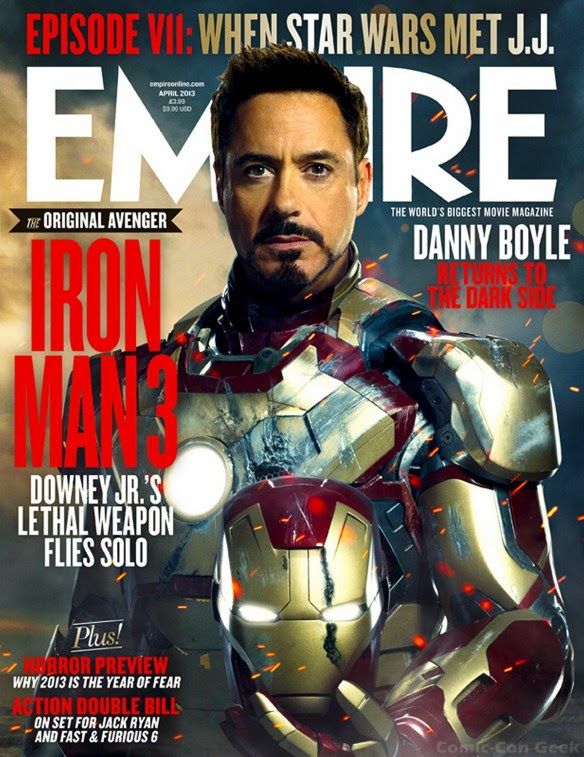
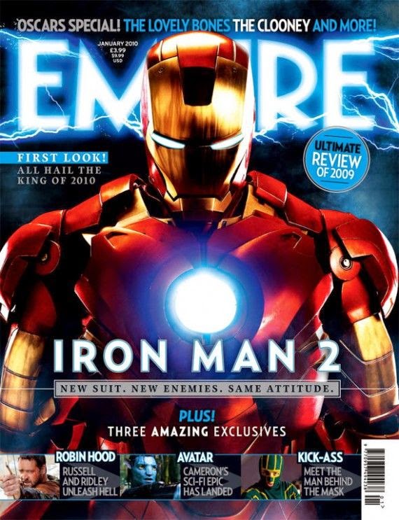
I have decided to use the scene where I used UV paint and UV light to give the glowing effect. Using a wine glass I will paint around it and put the UV paint inside. The character will pose with the cup whilst holding it, showing the electric pouring through the cup.
My front cover main image will be similar to these style models where it will be a mid shot from the waist up. However, because the movie poster shows the version of the character in the prison, I am undecided whether to show the other side of the story where she finds herself in riches once taken away from the prison.
I may go with this idea by changing the costume in order to suit the wine glass as well.
With having the shot of the UV light in the image, I plan to use the same technique as I did with the poster. For this I plan to draw out the electric bolts going through the glass using Photoshops effect that I had used.
Monday, 23 March 2015
Planning trailer and magazine
This week I plan to complete my trailer by adding the voice over. I plan to record this week and have the voices added by the end of the week. Once this is completed I hope to have started my movie magazine cover and be at a place of almost finishing my first draft of it.
Movie poster process
This is the original image that I had taken on a Nikon Coolpix camera. The image was taken in my kitchen where I knew that I could use the smudge tool to even out the colours and create a new background from the one that was already created.
This was the starting image with the painted background and the main image. This was the raw version with no added layers. The background was originally to be painted and left like that. However, I didn't feel like there was much dimension and texture to the image so I had then added layers and changed the occupancy in order to show the texture using different images.
All of the dystopian genre posters had either one or more persons in an action shot. With my poster I created this to show the main purpose of the story. That being that she is trapped and arrested for her powers.
To create the background of the image I had painted it in block colours originally. To create to realism and texture to the surfaces I took images of cobbled floor and brick walls and used the occupancy of them to just show the outline of the bricks over the main colour. I then photoshopped the main character in and painted the purple electric coming from her hands along with the shadow on the floor and dark depths of the main corner. I went with the bluish/ purple colour for the power to show the electricity. I used different shades of the colour in order to show it going from different directions and to stand out from the main background.
With the main title shown below, I didn't want just block lettering with no dimension. To create a more complex title I used the eraser tool to remove pieces of the lettering and re painted them further off to give the illusion of the title shattering a little and eroding away.
This is the finished movie poster with all of the conventions of any magazine. This includes the main title being 'Shatter me'. All of the posters also shown the producers who would work on the film including set design and costume design- anyone who would have contributed into making the movie. In addition, it shows the rating of the movie and the logo to the production company. The main actors name is also displayed along the top. This is used so that people can recognise the name if they are looking for movies of their favourite actors.
Thursday, 19 March 2015
Monday, 16 March 2015
Question 1
In which ways does your media product, use, develop or challenge the forms and conventions of Media Products?
Movie Trailer title
For the title used on the movie trailer, I had to create it in Adobe Flash. I first used photoshop to create the 'glass' pieces. I made three different ones. I then opened them in flash and duplicated them for the appropriate amount. I then added motion tween and arranged them into the 'SHATTER ME' title.
Almost 40 different motion tweens where used to create this.
Here is the finished result:
Editing update
As for editing the movie trailer, I have almost completed it. With adding the additional scenes filmed from the weekend I have been able to finish the visual editing. Now I am at a stage where I can plan for the voice over. In order to do this I will write up a short script and record it. Once this is completed, the editing process of the movie trailer will be completed and I will move onto the next task.
Filming update
As I have gone down to London for the weekend, I had managed to finish my filming whilst referring back to my storyboard. I had filmed additional scenes to use as the ending scenes.
I had originally had an idea of using FX to use as a super power for the character. I needed an electric sort of effect in order to give off the main purpose of the storyline. As I couldn't find the appropriate way to create this, I had decided to do it in a more simpler way that I could control more. For this I used UV nail polish under a UV light. I painted lightening on my wall where the character would punch the centre and the wall will glow. I also used it on the characters hands to show that it is coming from her.
I had originally had an idea of using FX to use as a super power for the character. I needed an electric sort of effect in order to give off the main purpose of the storyline. As I couldn't find the appropriate way to create this, I had decided to do it in a more simpler way that I could control more. For this I used UV nail polish under a UV light. I painted lightening on my wall where the character would punch the centre and the wall will glow. I also used it on the characters hands to show that it is coming from her.
Wednesday, 25 February 2015
Filming location
As I will visiting London in two weeks, I have decided to film there as my sister will be with me. Additional scenes including a Library scene has been added to the storyboard so I will visit the library in order to film the rest. I have also added parts in the dark so before leaving on the Saturday to London, I will film these smaller scenes at my home on the Friday night.
Monday, 23 February 2015
Filming update
Last week I visited Bath Spa university where I stayed for two days, however, I had forgotten to take the camera with me. For the remaining week my sister (the main character) had gone away in a caravan for the rest of the week so I was unable to film then.
I plan to now create a new storyboard for the last little part of the movie trailer in order to have a clear idea of what to film once I have the chance to use the camera again.
I plan to now create a new storyboard for the last little part of the movie trailer in order to have a clear idea of what to film once I have the chance to use the camera again.
Monday, 9 February 2015
Additional scenes
As for additional scenes to film, I have decided to add some more actions scenes. For example, some shots of the character running. As for speech scenes, I have decided to do another voiceover from a diary entry from Juliet.
Filming Locations
For a university interview this weekend, I will be visiting Bath for two days. Due to this, I hope to film as the architecture is old and wary. I find this to be a good setting for my genre. As the actress will not be with me for filming, I plan to do some simple scenery shots.
Wednesday, 4 February 2015
Audience
With the main characters being of similar age, I have decided on my audience to be aimed towards teens and young adults. As most book to movie adaptations are now reaching a younger audience with the dystopian genre, I have decided to do the same.
Production
This is a video I have created in Adobe Flash Animation. This will be used in my movie trailer as the productions name. I have created it first in Photoshop where I had a transparent background for one 'W'. I then made this video by using key frames to move the production name on a black screen to which I then converted into a (mov.) file.
Movie poster progress
With my current movie poster, with addition to the research on dystopian movie posters. I have decided to restart the poster in order to fit the genres criteria. I have decided to do this with an action shot to which the background is more converse than the actual character image.
front cover style models
As for the movie magazine cover, I have been looking at potential style models. I have been looking at the magazine 'EMPIRE'. I have found that the conventions of the main image is either a scene taken from the movie or a shot from head on.
Movie poster style models
With the thriller/ dystopian genre for my movie trailer, I have been looking at potential style models for my movie poster. With the two genre I have found recurring themes. With the thriller posters, I have found that there is only one character and is usually a profile shot. With dystopian movie posters, there is usually one or more characters and is usually a full body shot. This also includes a themed background as well that is featured in the movie.
I have decided to go with the more dystopian looking trailer as it looks like the movie has more action rather than a thriller poster that makes the movie look serious and a potential horror.
Thriller posters
Dystopian posters
I have decided to go with the more dystopian looking trailer as it looks like the movie has more action rather than a thriller poster that makes the movie look serious and a potential horror.
Thriller posters
Dystopian posters
Tuesday, 3 February 2015
movie poster
This image now has the saturation changed to make the image look darker. The flooring on the image has has another image over it of stones and the occupancy has been changed to allow some of the original colour to come through.
Movie poster
This is the original beginning image for the movie trailer poster. I took this photograph on a Canon Coolpix camera. It was shot in a corner as this would make is easier for further editing on the image.
This image is the same background as the original. However, the background has been stretched with the smudge tool in order to extend the room to fit the size of the page. I then added paint in a similar colour and a spray tool to create shadow on the walls.
Monday, 2 February 2015
Beginning voiceover script
I have decided to follow the blurb of the book that I am basing my trailer off, in regards to the voiceover script. This will be used along side the beginning of the trailer. At the beginning it will be the psychiatrist contradicting the main character Juliet.
Psy: Juliet...what do you think is wrong with you?
Jul: I have...this...curse
Psy: Juliet, its a gift
Jul: I'm a monster
Psy: Your simply more than human
Jul: My touch is lethal
Psy: Your touch is power
Jul: I'm a weapon for them
Psy: Then fight back
Psy: Juliet...what do you think is wrong with you?
Jul: I have...this...curse
Psy: Juliet, its a gift
Jul: I'm a monster
Psy: Your simply more than human
Jul: My touch is lethal
Psy: Your touch is power
Jul: I'm a weapon for them
Psy: Then fight back
Voiceover
I plan to have the characters speak through a voiceover so that it can flow in and out of scenes. These three characters will include the main character Juliet, a psychiatrist and the main male, Warner. My sister will be the part of Juliet, my friend Jasmin will be the psychiatrist and Warners voiceover is still un-decided.
Tuesday, 27 January 2015
Trailer update
The current editing of the trailer is still in its process. However, the beginning of the trailer (around a minute worth) is nearly complete, with the exception of adding two female voiceovers that are contradicting each other. The second half of the trailer is currently underway however i may need to film more scenes. I hope to add a few more landscape shots and shots of the characters in more action sort of situations. Currently, the music is very upbeat throughout the second half and the action scenes that I have already filmed do not fill up most of it and are not very thrilling.
Whilst doing this, I am making constant check throughs on my trailer style models to check that the genre of my trailer is clear.
Whilst doing this, I am making constant check throughs on my trailer style models to check that the genre of my trailer is clear.
Monday, 26 January 2015
Added scenes
I plan to add a male voiceover to the current movie trailer. However, I do not have the character. I hope to find someone for an added character in the trailer and add a bit more diversity with the two characters being contradicted by each other. I plan to do this at the start using a separate voiceover of a woman to act as a psychiatrist. The main character will argue statements from this character.
trailer
Music
Mercury Rises- Trailer Music
This is the music I am using for my movie trailer. The audio clip has been edited in Garage Band to be made smaller and the music more snappy for the videos used in the trailer. I chose this piece of music because it is upbeat and sounds like an action movie trailer song. However, this audio clip is not the edited version.
This is the music I am using for my movie trailer. The audio clip has been edited in Garage Band to be made smaller and the music more snappy for the videos used in the trailer. I chose this piece of music because it is upbeat and sounds like an action movie trailer song. However, this audio clip is not the edited version.
Monday, 19 January 2015
Trailer start
Wednesday, 7 January 2015
Filming locations
The locations in which we have filmed are all the same except for Bidston Hill. We ended up filming in a local park where other scenes could be filmed in the one place as well. As for timing, it was done after school just before it was too dark outside. This was done for the effect it will give off on the clip and showing what sort of genre it is.
Filming update
Due to the actor not able to be free for filming, I had to re-film using somebody else and additionally add more scenes. I had originally filmed half of the trailer and edited it. However, there is no music to it yet.
Subscribe to:
Comments (Atom)


