My main product is the style model for all of my ancillary texts. Based on the decisions I have made with the genre of the movie trailer and how it is presented, I wanted to foreshadow this in my poster and magazine front cover. From the conventions of the poster, it is shown that it is of a dystopian genre. These conventions include the way it is presented with the Sci-fi look to the electricity show from the hands of the main character. This gives it the futuristic look that sets it apart from being a horror movie poster. The combination of both the poster and trailer both contribute to the genre and make it seem like an action packed film, this may bring in a male audience as most teen dystopians are more directed towards female young adults.
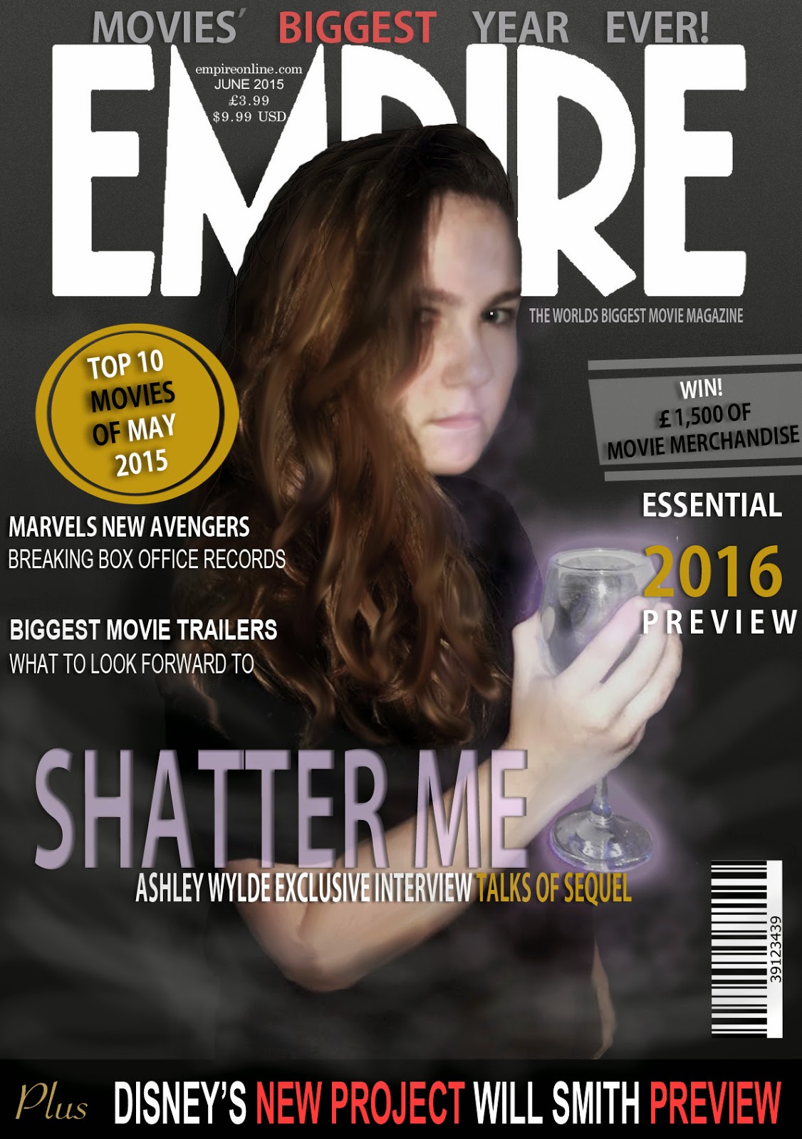
 As for my magazine front cover, I had researched into 'EMPIRE' magazine covers for style models. With taking into consideration all of the conventions I had seen from the style models, I had also compared it to how the cover themselves linked to their trailer of the movies. For example, this iron man 2 cover connotes to the genre of the movie being a futuristic action movie. I wanted to recreate this by looking back at my main task and using techniques for the main image that I had used whilst filming. In my opinion, a more effective scene in the trailer was where I had used UV paint and light to make a 'cracked electric' look on the wall. I wanted to recreate this in an image by taking this and adding it to the image, giving it the dystopian (futuristic) action genre to the cover. Whilst choosing the wine glass to glow, I took into account the story line of the trailer. This being that the main character is contained and then thrown into a more rich lifestyle as a bribe to become a weapon for the opposing team. With giving the wine glass, I wanted to create an effective distinction between the way she is presented and how she feels about it. I gave her the sophisticated look by giving her the wine glass, but with the electric going through it- connotes that she is against it.
With my movie poster, I had the similar idea to link to the main task, however taking the opposite side to the story and showing the confinement of the main character in the cell. I used different connotations to relate to the story line of the movie trailer. For example, I created the main characters shadow stretching out from the corner to show the other side to her and connote that it is 'reaching out'. This gives a darker meaning to the poster as their are darker sides to the story. To create the action/ dystopian aspect of the poster, I once again added the electric to the walls to suggest that she will fight to get released from the cell and fighting back suggesting the action genre to the movie.
Overall, all of my tasks have been planned out to link the the main task in order to give an effective advertising to people who may be interested and give the 'sneak peak' into what the movie is going to be about.
No comments:
Post a Comment